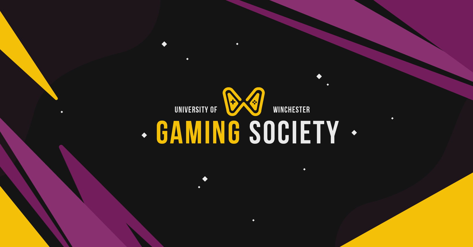
A University Gaming Society in Winchester was in urgent need of a refreshed visual identity to help increase engagement and attract new members. Prior to this project, their branding was inconsistent and fragmented, with assets created on an ad hoc basis and no clear guidelines in place. This resulted in a disjointed and unrecognisable identity, making it difficult for the society to stand out or be easily identified. By developing a cohesive visual identity, the society would become more recognisable, ensuring that promotional materials such as flyers and posters gained greater attention and, in turn, encouraged more sign-ups. Additionally, consistent branding across social media and their Discord hub would allow audiences to quickly understand who they are and clearly identify events associated with the society.
In response, my role as a freelance brand designer was to create a comprehensive set of brand guidelines, alongside key visual assets such as a logo, to support consistent and effective communication across all marketing materials and platforms moving forward.

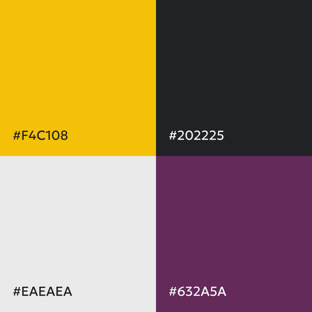
To approach this project, I began by developing a range of initial sketches and colour palette options to present to the client. This allowed me to clearly communicate my design thinking while also inviting collaboration early in the process, giving the client the opportunity to suggest adjustments before progressing to final designs. Taking this approach ensured alignment from the outset and helped establish a strong understanding of the client’s identity, preferences, and vision for the project.
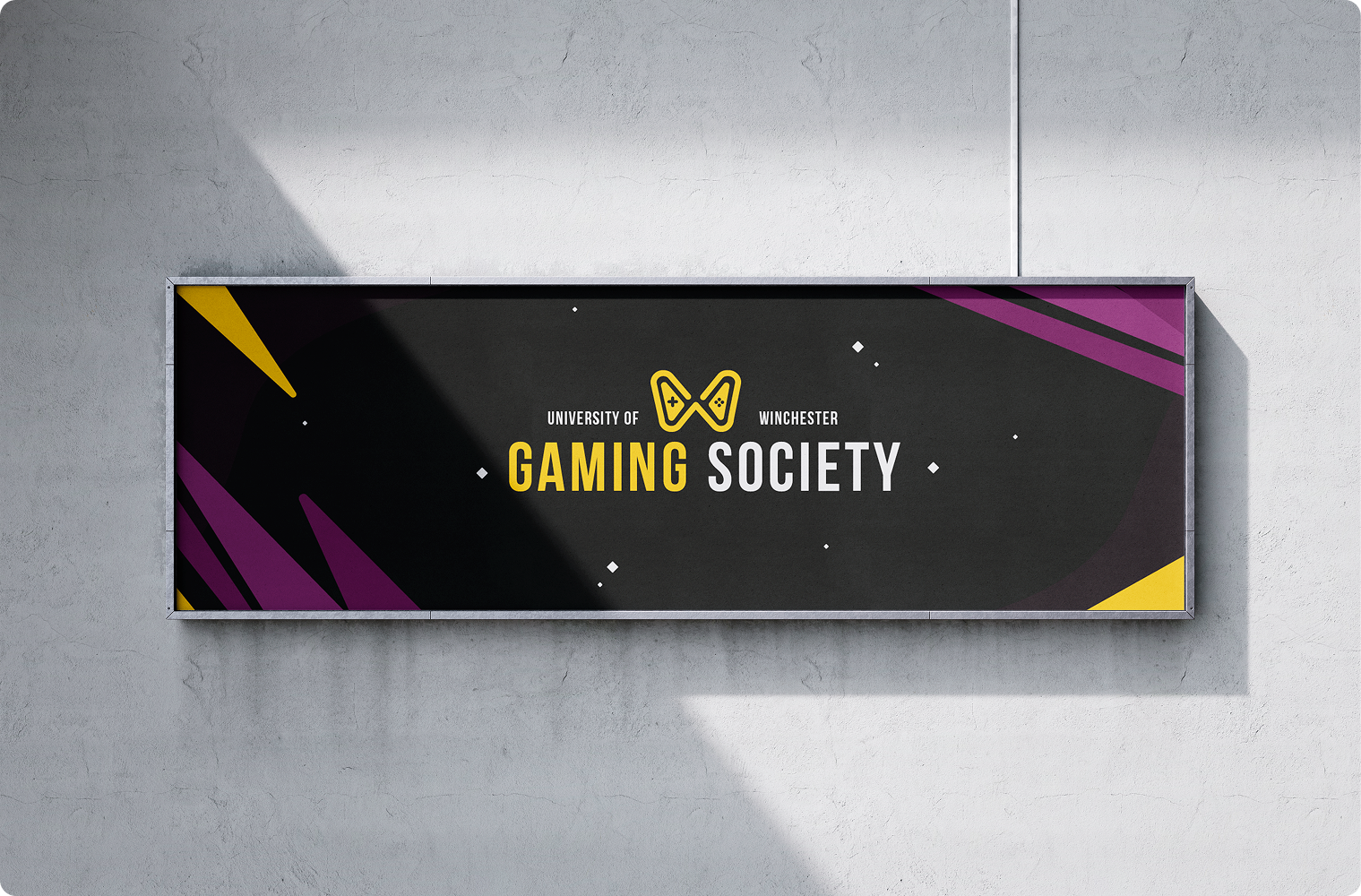
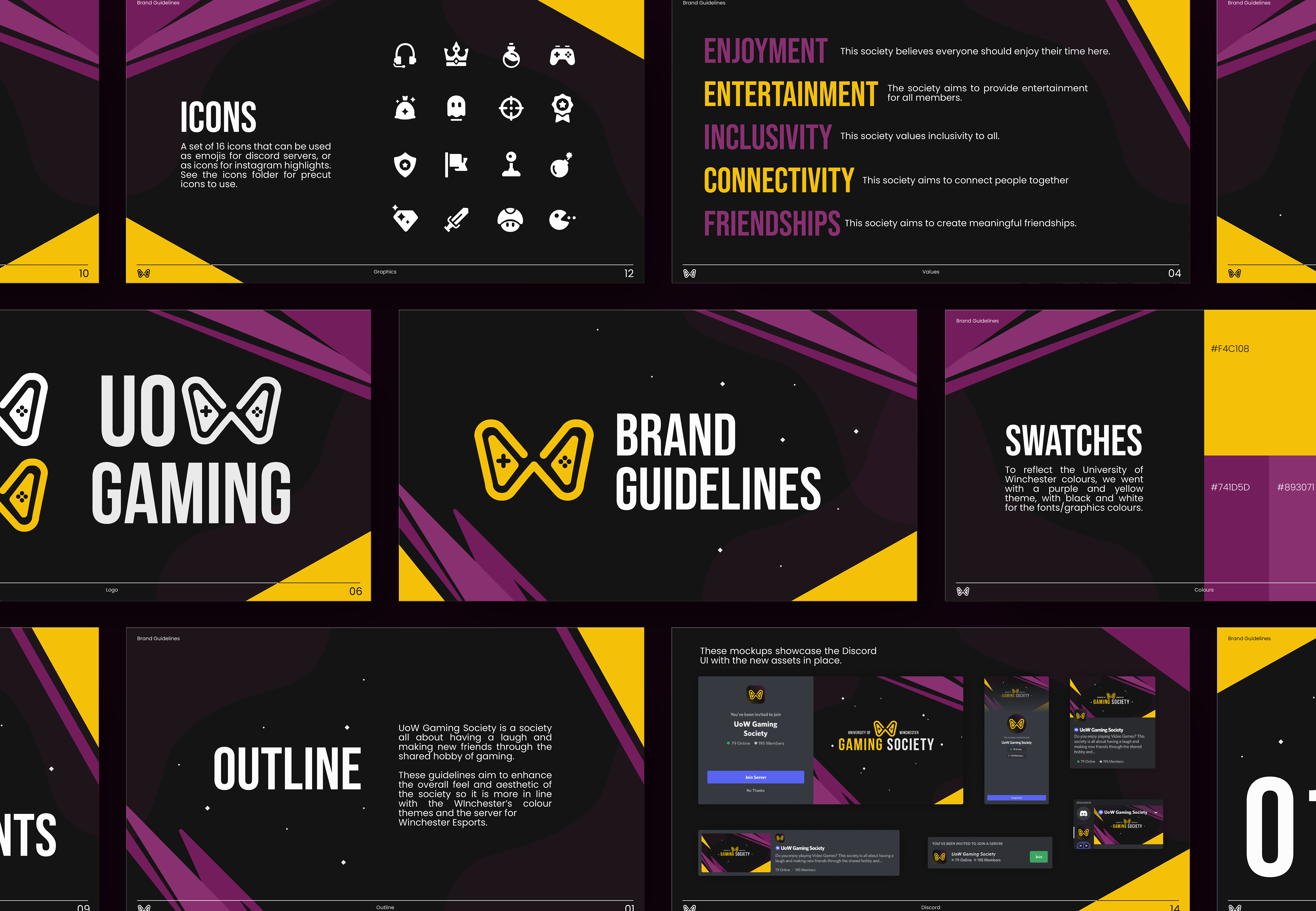
Together, we agreed on a colour palette centred around deep purples to reflect the University of Winchester’s existing visual identity, complemented by a bold yellow to create contrast and improve visibility. The final logo concept featured an abstract “W” shaped like a game controller, immediately conveying both the society’s connection to Winchester and its focus on gaming.
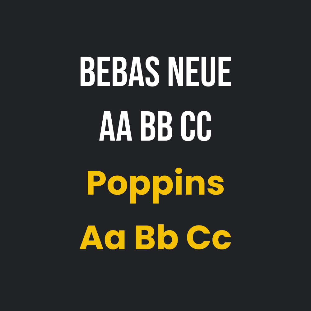
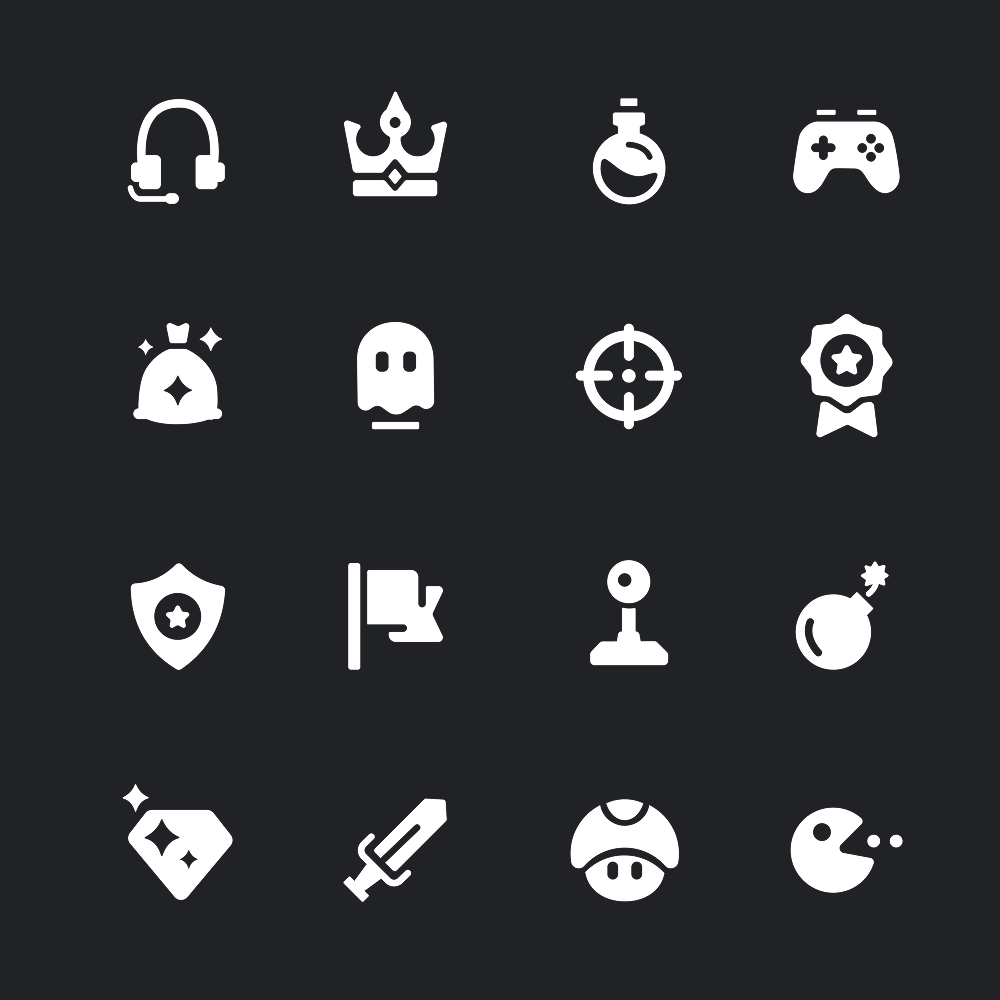
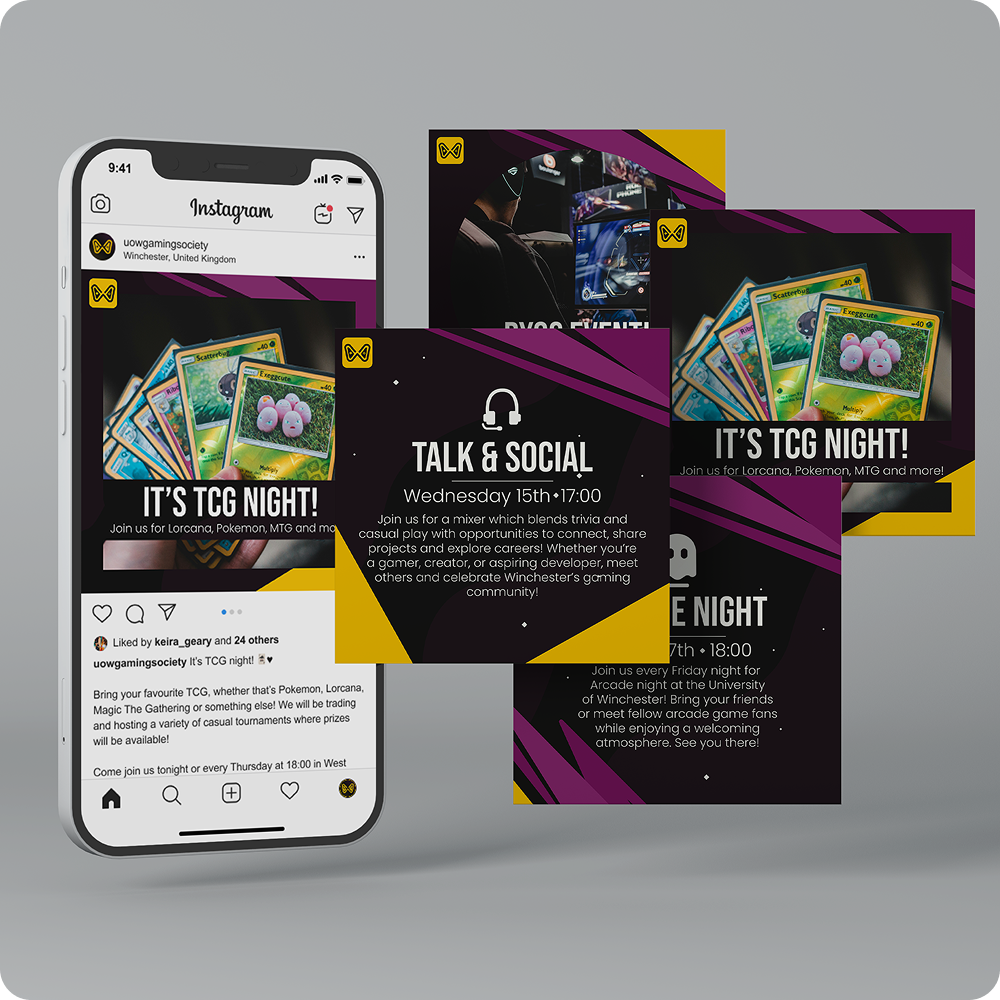
Once the logo and colour palette were approved, I developed a comprehensive set of brand guidelines. These outlined the rationale behind key design decisions, defined the brand values, and provided clear instructions on how to apply visual assets consistently. Alongside this, I delivered a suite of supporting materials, including icons and social media assets such as banners and post templates. This ensured a complete handover of the brand, enabling the society to confidently produce future communications and marketing materials, even without ongoing input from a designer.

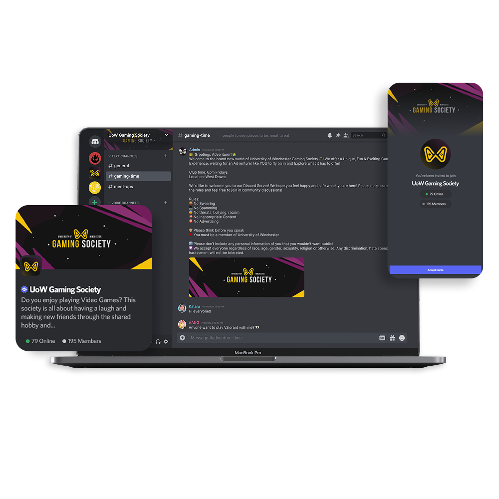
Throughout this project, I explored designing specifically for Discord servers, an area I had not worked in previously. Understanding how banners, logos, and other visual elements are displayed across different devices presented a unique challenge, requiring careful consideration to ensure the design remained consistent, readable, and visually effective in all formats. This was an engaging learning experience, as it highlighted how a single design can be viewed in multiple contexts depending on the platform and device. It also deepened my understanding of the importance of spacing and composition, particularly the role of negative space in maintaining clarity and impact within digital environments.
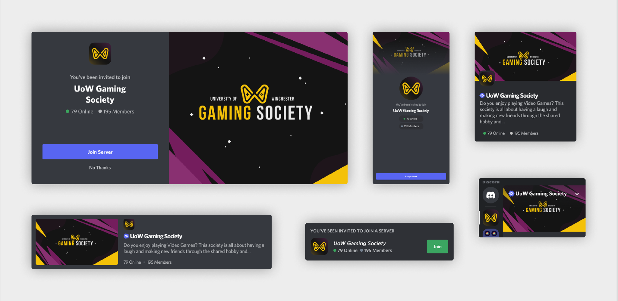
The outcome of this project was a cohesive visual identity that is instantly recognisable as the Winchester Gaming Society, drawing on the University’s colour palette and an abstract, letter-based logo. The refreshed brand now stands out more effectively, contributing to increased engagement, with flyers created using the new brand guidelines being distributed across the University to support sign-ups. The bold geometric forms and darker colour scheme also help to immediately communicate the society’s gaming focus.
Through the delivery of complete assets, including full logo files, social media templates, and comprehensive brand guidelines, the society is now equipped to produce consistent and professional communication materials independently. This ensures a more unified and structured approach moving forward, eliminating the previous issues of inconsistency and disjointed branding.
Explore a selection of collaborative projects, using motion and design to communicate ideas and bring them to life.