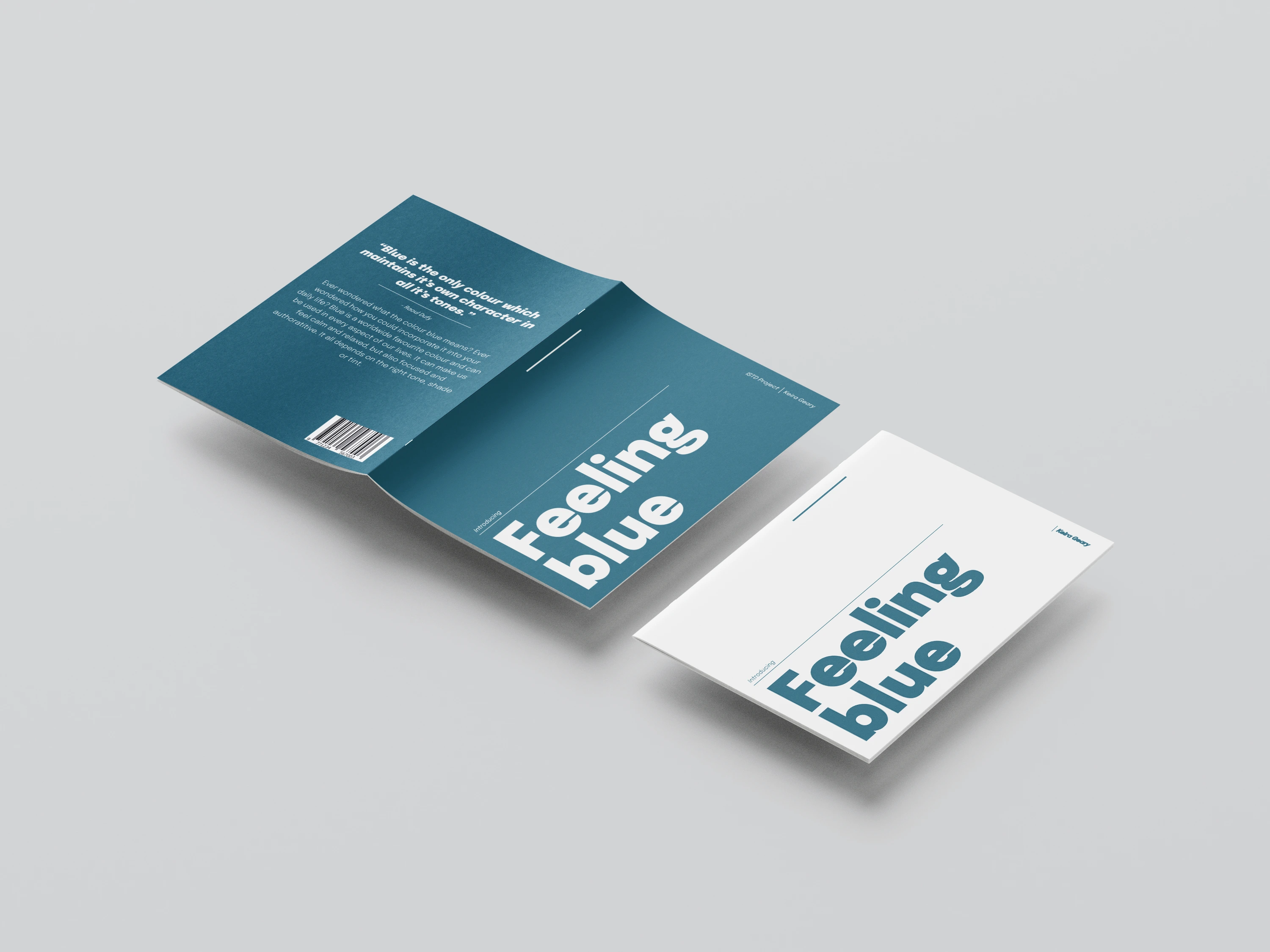
This project introduced me to the ISTD (International Society of Typographic Designers), a group dedicated to achieving the highest standards of typographic excellence and visual communication. We were given the 2022 ISTD student briefs, which offered a selection of projects focused on exploring typography in different contexts. The brief I chose to pursue was “A Colourful Story”, which focused on investigating a single colour and the history behind it.
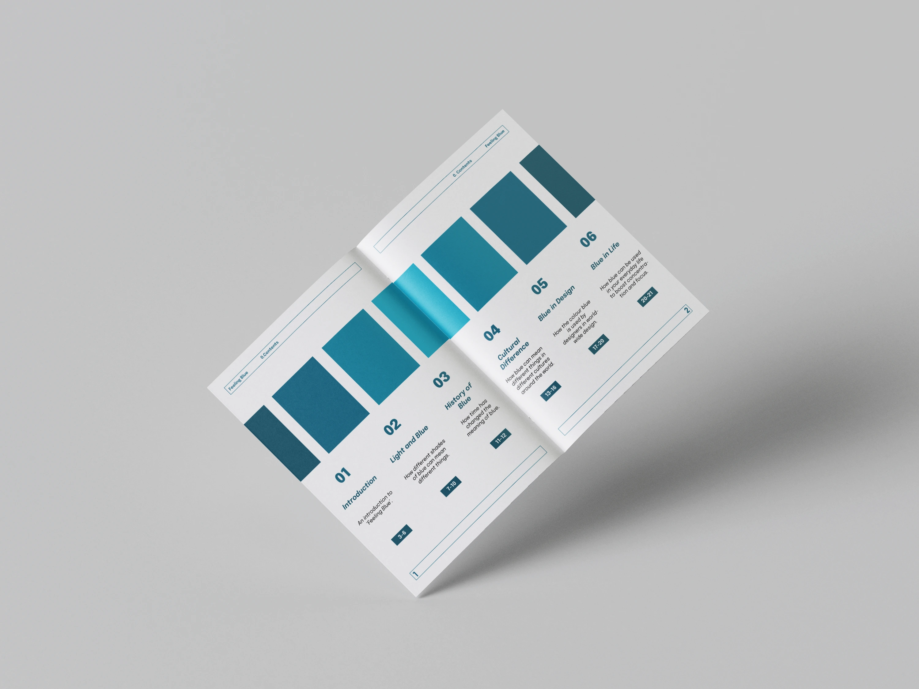
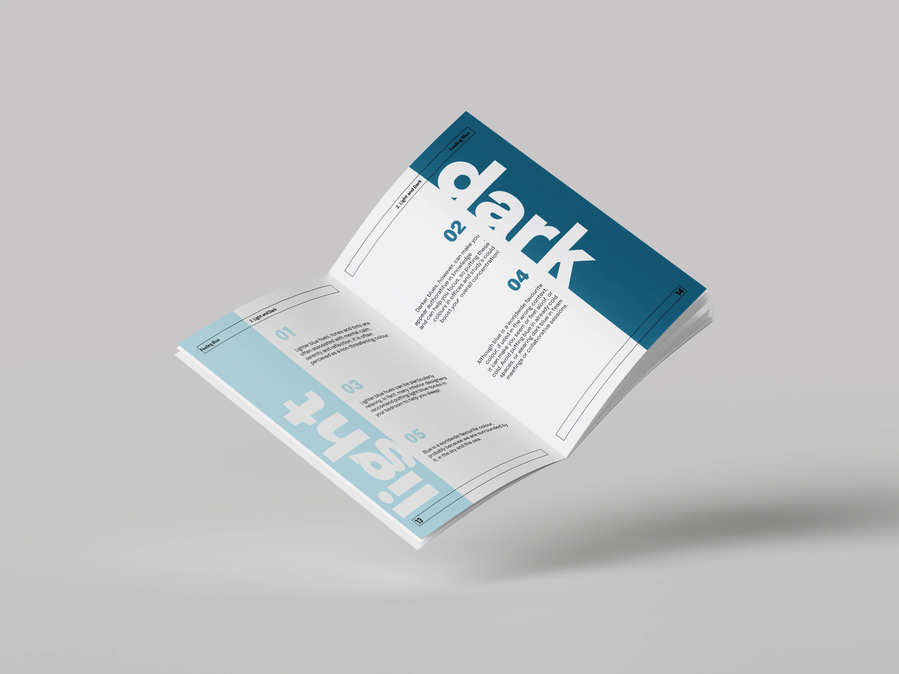
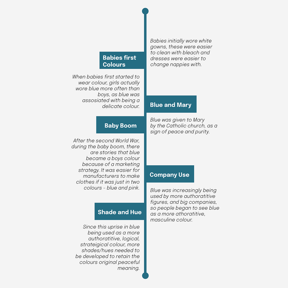
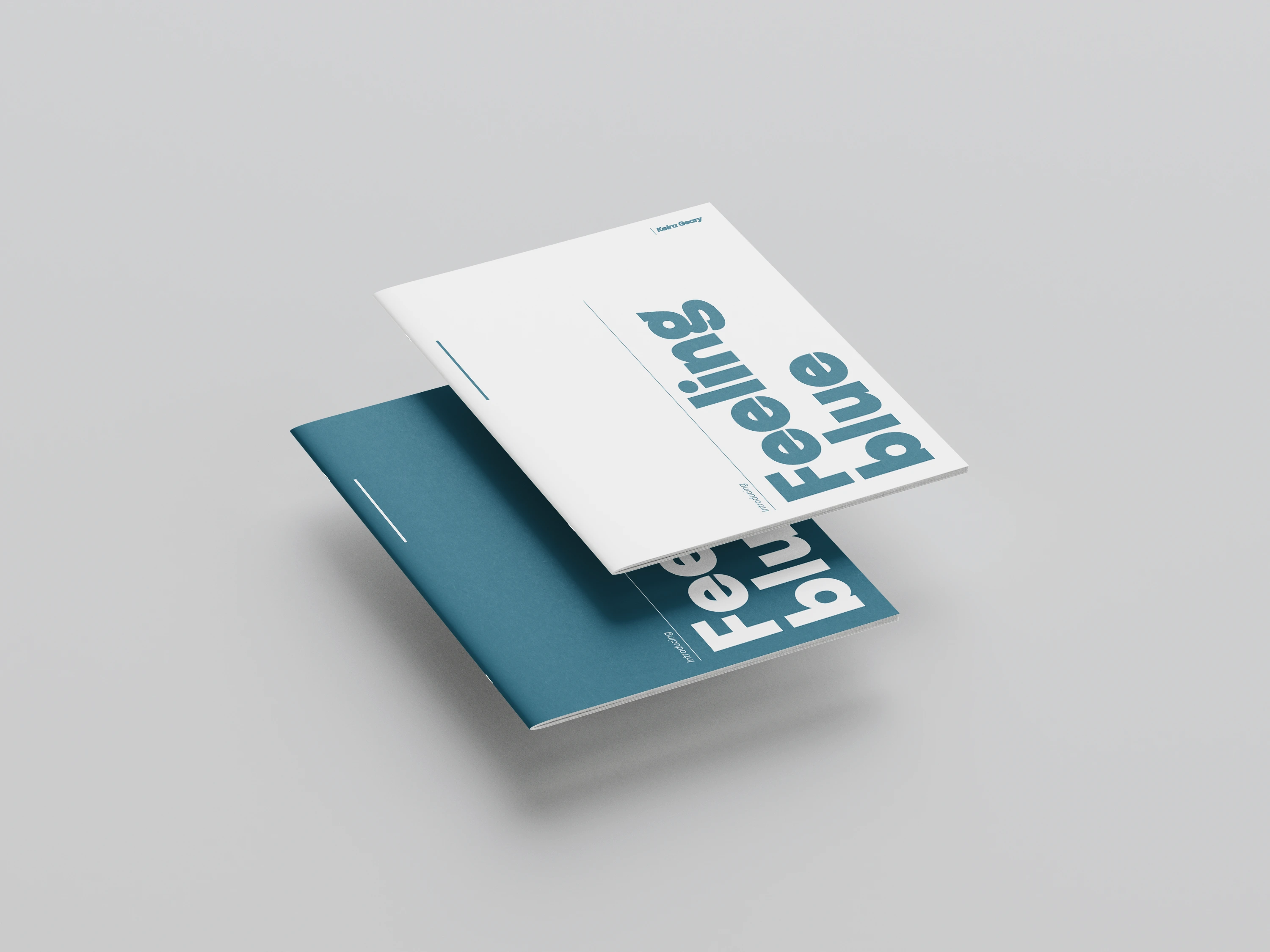
After considering several options, I selected the colour blue due to its rich and varied history, as well as its evolving cultural and psychological associations over time. This exploration led to the creation of a printed book design that communicates the historical development and psychological impact of the colour through expressive and considered typographic design.
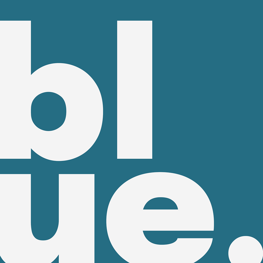
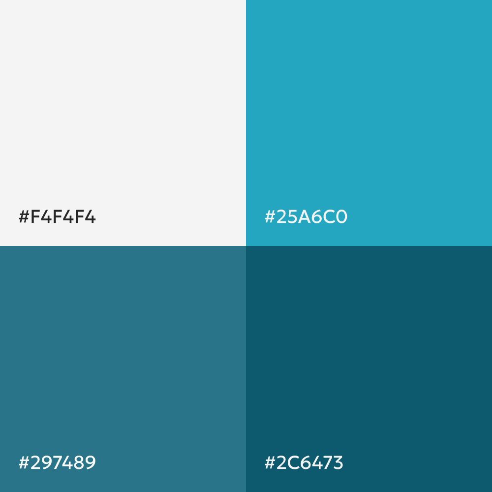
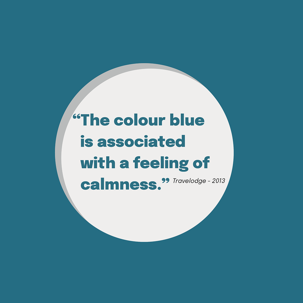
Throughout my research, I discovered that blue is widely regarded as the world’s favourite colour, which prompted me to explore the reasons behind this preference. Although there is no definitive explanation, research suggests that its popularity may be linked to its strong presence in nature, particularly in the sky and the sea, which are universally familiar and calming associations. A significant portion of my research was informed by The Little Book of Colour by Karen Haller, which provided valuable insights into the psychological and cultural meanings of blue, helping to shape the content and direction of my project.
I also explored typography to determine the most appropriate typefaces for the design. Sans serif fonts are commonly used in informational and editorial contexts due to their clarity and legibility, so I selected this style as the primary type choice for the project. To introduce visual hierarchy and subtle variation, I paired it with a complementary type treatment for secondary elements such as page numbers.
Due to the three-week timeframe allocated for this project, I made the decision to focus on developing a strong and well-considered project proposal rather than producing a complete book. This approach allowed me to fully communicate the concept and design direction without the risk of rushing production and compromising the quality of development across multiple pages.
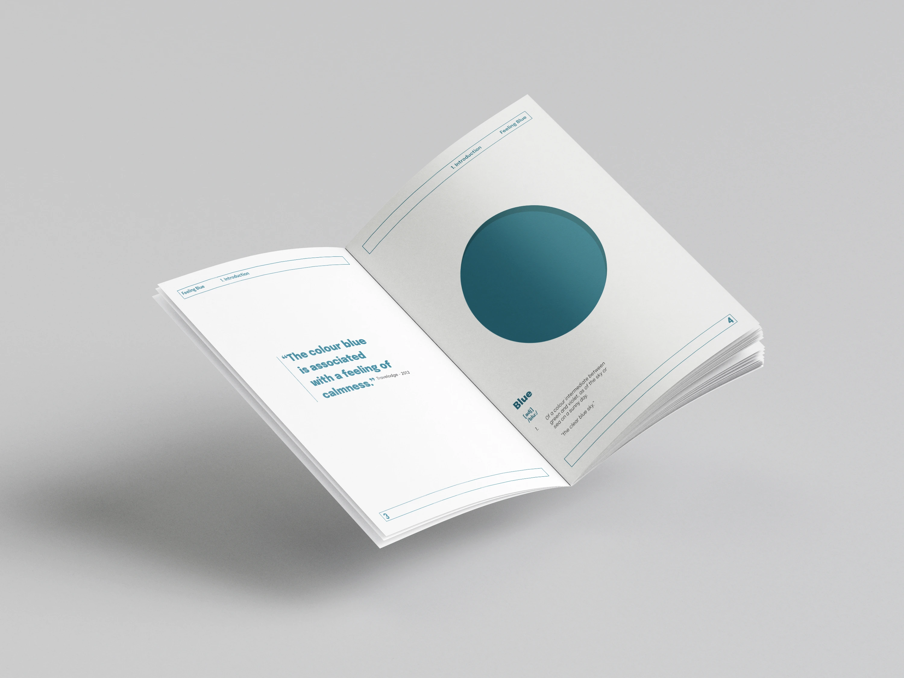
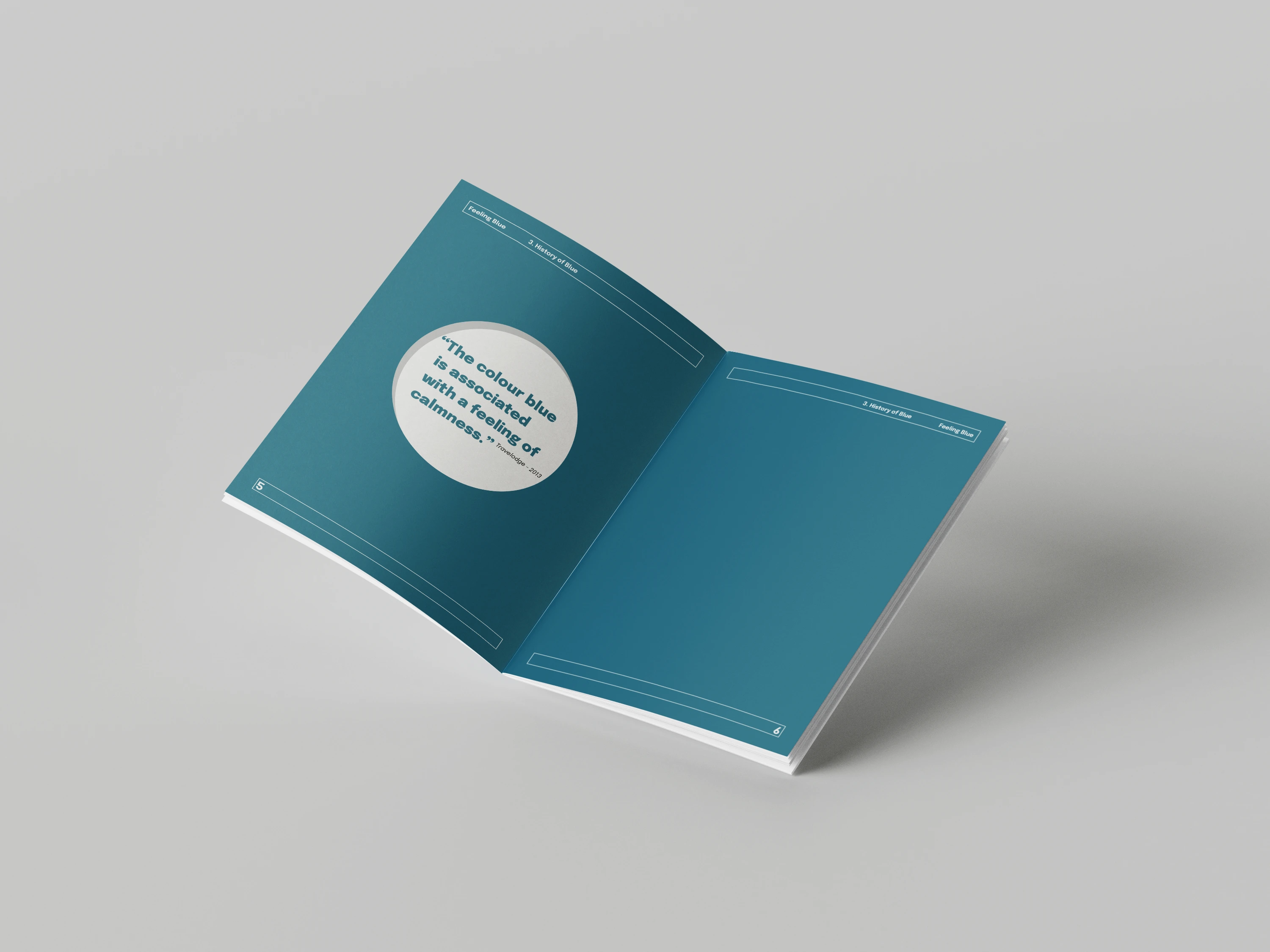
Overall, this project was successful as it allowed me to develop a range of new skills, including an introductory understanding of Adobe InDesign, as well as gaining in-depth knowledge of the history and cultural significance of the colour blue, which will inform my future use of colour in design work. I also gained valuable insights into typography, layout principles, and appropriate approaches to structuring editorial projects.
This project responds effectively to the brief through thorough research, from initial exploration of the concept through to typographic development. The outcome serves as a considered project proposal, clearly communicating the intended direction and potential development of the final piece.
If I were to continue or revisit this project, I would develop a dedicated type and layout specification sheet. This would further strengthen my understanding of typographic systems and demonstrate a more structured and consistent approach to using type within my design work.
Explore a selection of collaborative projects, using motion and design to communicate ideas and bring them to life.